

Most small businesses lose customers before a single conversation happens. A visitor lands on your site, looks around for a reason to trust you, finds nothing convincing, and leaves. A dedicated small business social proof display page changes that equation. Instead of scattering a few testimonials across random pages and hoping for the best, you create one authoritative hub where your best evidence lives. This guide walks you through what to gather, how to build it, how to optimize it for conversions, and what to avoid along the way.
Table of Contents
- Key takeaways
- Your small business social proof display page: what you need first
- How to build and structure your social proof page
- Optimizing for credibility and conversions
- Common mistakes that hurt your social proof page
- Measuring success and scaling your strategy
- My honest take on social proof pages for small businesses
- Build your business presence with Vyntr
- FAQ
Key takeaways
| Point | Details |
|---|---|
| Dedicate a page to proof | A standalone social proof page acts as a trust hub that supports every stage of the buyer journey. |
| Stage proof by buyer intent | Match testimonials and review types to where visitors are in the decision process for better results. |
| Place proof near your CTAs | Positioning social proof adjacent to primary calls-to-action can lift conversions by up to 68%. |
| Limit your proof stack | Combining 3 to 5 social proof types delivers the strongest lift; adding more types produces diminishing returns. |
| Measure and keep improving | Track conversion rate, bounce rate, and pages per session to know what is actually working on your page. |
Your small business social proof display page: what you need first
Before you build anything, you need the right raw materials. Social proof is not a single thing. It is a category that includes several distinct formats, and the ones you choose will shape how your page performs.
The most effective types for small businesses are:
- Text testimonials: Short, specific quotes from real customers. The best ones name a concrete result ("We cut our onboarding time in half").
- Star ratings and review counts: Pulled from Google, Yelp, or industry platforms. These carry weight because they come from third-party sources.
- Client logos: If you work with recognizable businesses, their logos function as instant credibility signals.
- Video testimonials: Higher effort to collect, but significantly more persuasive than text alone.
- Case studies: Longer-form proof that walks through a specific problem, your solution, and the measurable outcome.
Different proof types serve different stages of the buyer journey. Awareness-stage visitors respond to highlight reviews and quick stats. Decision-stage visitors need detailed testimonials and case studies. Your page should serve both.
Here is a quick reference for choosing the right format:
| Proof type | Best use case | Display format |
|---|---|---|
| Text testimonials | Decision stage, product pages | Grid, carousel, wall |
| Star ratings | Awareness, trust signals | Badge, aggregate score |
| Client logos | B2B credibility, homepage | Logo strip |
| Video testimonials | High-consideration purchases | Embedded player |
| Case studies | Complex services, B2B sales | Linked cards or summaries |
For collection, start with a simple email sequence that goes out after a purchase or project completion. Tools like Google Forms work fine at first. As you scale, look at platforms that can embed reviews directly onto your site. Review widgets can pull from multiple sources, auto-update as new reviews come in, and display in grid, carousel, or badge formats without manual work on your end.
Pro Tip: Before you build the page, audit what you already have. Check your email inbox, Google Business Profile, and any industry review platforms. Most small businesses are sitting on more usable proof than they realize.
How to build and structure your social proof page
Structure matters as much as content. A page that dumps 40 testimonials in a wall of text will not convert. You need a layout that guides the visitor from "I'm curious" to "I'm convinced."
Here is a step-by-step process that works:
- Lead with your strongest stat or aggregate rating. Put your overall star rating, total review count, or a headline result ("Trusted by 500+ small businesses") at the very top. Visitors decide within seconds whether to keep reading.
- Add a logo strip if you have B2B clients. Right below the headline stat, a row of recognizable client logos does heavy lifting. You do not need to say anything. The logos speak.
- Place your top three to five testimonials in a featured section. These should be your most specific, result-oriented quotes. Use a card layout with the customer's name, photo if available, and company or context.
- Follow with a filterable or categorized review section. Let visitors sort by product type, service, or use case. This is especially useful if you serve multiple customer segments.
- Close with deeper proof. Case studies, video testimonials, and longer written stories belong at the bottom. Visitors who scroll this far are seriously considering you. Give them the detail they need.
- Add a clear CTA at multiple points. Do not wait until the end. Place a button or contact form after the featured testimonials and again at the bottom of the page.
Front-loading trust signals early in the page, then layering in deeper proof below, mirrors how buyers actually process information. They scan first, then read when they are interested.
For the technical side, most website platforms support embeddable review widgets. Whether you are on WordPress, Squarespace, or a custom build, you can typically install a widget that auto-syncs from Google or other platforms. Set it to display newest reviews first, and configure it to pull from verified sources only.

Pro Tip: Do not use a static page that you update manually. Auto-syncing widgets keep your proof fresh without ongoing effort, and fresh reviews signal to visitors that your business is active and trusted right now, not two years ago.
Optimizing for credibility and conversions
Building the page is step one. Optimizing it for actual conversions is where most small businesses leave money on the table.
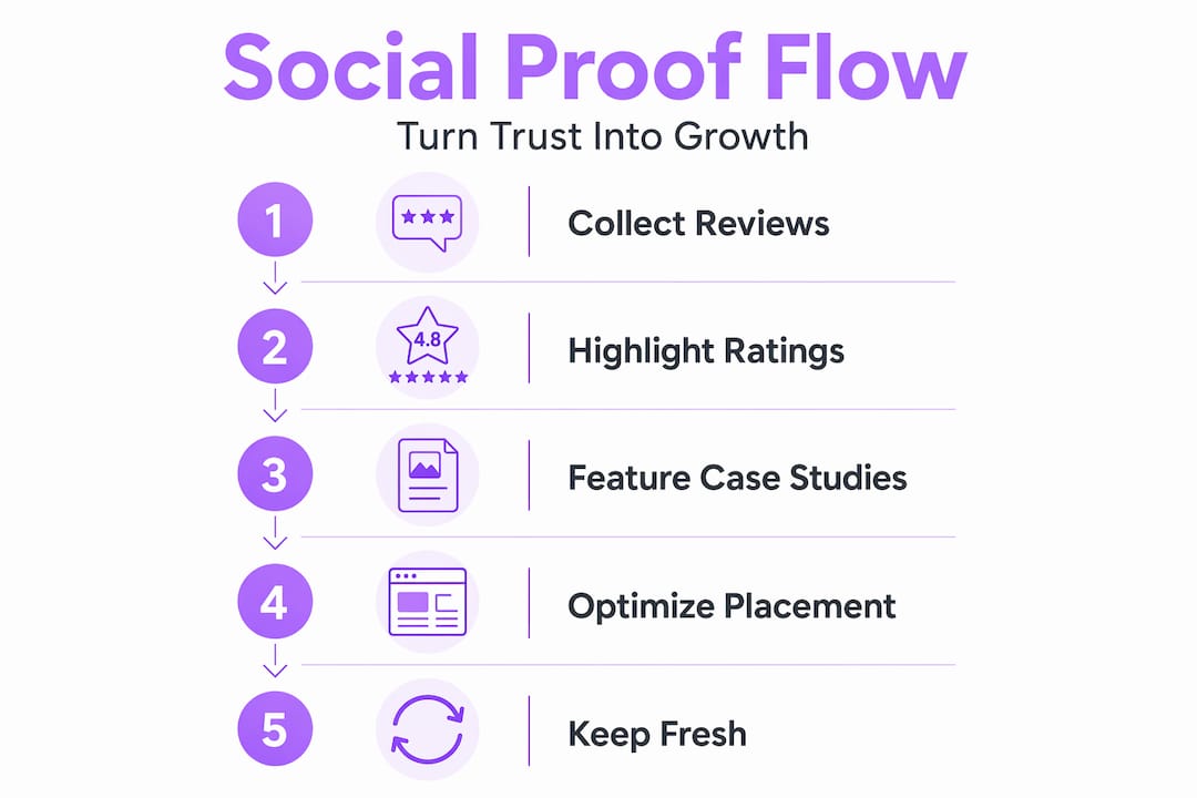
The single highest-impact move you can make is positioning. Changing proof placement near your primary CTA can have a greater impact on conversion than the type of proof you show. One case study found a 68% conversion lift simply by moving social proof adjacent to the call-to-action button, with no other changes.
Beyond placement, here is what separates a high-converting social proof page from an average one:
| Tactic | Why it works | What to avoid |
|---|---|---|
| Verified purchase badges | Confirms reviews are real, not planted | Fake verification labels that cannot be confirmed |
| Timestamps on reviews | Shows recency and active customer base | Hiding dates, which signals stale reviews |
| Mixed star ratings | Feels authentic; all-five-star looks manufactured | Filtering out every negative review |
| Response to reviews | Shows you engage and care | Ignoring critical feedback publicly |
| Multiple proof types (3 to 5) | Combining testimonials and logos yields up to 84% conversion lift | Stacking more than five types, which adds clutter |
On verified badges specifically, the key is that verification must be real. Verified purchase badges should be backed by actual order data. Pairing them with a photo and a response from your team compounds the trust signal considerably.
One counterintuitive point: do not hide your three or four-star reviews. A page with only perfect scores looks curated and raises suspicion. Showing a realistic mix, while still skewing positive, reads as honest. Honest reads as trustworthy.
For ongoing maintenance, set moderation rules on your widgets to pull from multiple verified sources, refresh the display order regularly, and filter for reviews that include enough detail to be useful. A one-word review like "Great!" adds almost nothing.
Common mistakes that hurt your social proof page
Even well-intentioned social proof pages fail because of avoidable errors. Here are the ones that show up most often:
- The trophy shelf mistake. This is the most common and most costly error. You build a beautiful social proof page, then leave it isolated. Visitors who never find it never benefit from it. A dedicated page needs to be paired with embedded proof on your homepage, product pages, and near every major CTA. The page is the depth; the embedded snippets are the reach.
- Widget overload. More is not better. Stacking six or seven different proof formats creates visual noise and decision fatigue. Stick to three to five types and make each one count.
- Hiding proof below the fold. If your strongest testimonial is at the bottom of the page after three paragraphs of copy, most visitors will never see it. Lead with your best evidence.
- Using unverified or outdated reviews. A glowing review from 2021 does not reassure a 2026 buyer. Stale proof can actually undermine credibility by making your business look like it peaked years ago.
- Mismatching proof type to buyer stage. Showing a long-form case study to someone who just discovered your business is like handing someone a contract before saying hello. Match the depth of proof to where the visitor is in their decision process.
The fix for most of these is the same: think about your page from the visitor's perspective, not your own. You are proud of all your reviews. Your visitor just wants to know if you can solve their specific problem.
Measuring success and scaling your strategy
Launching your page is not the finish line. The real work is measuring what happens and improving from there.
Start by tracking these four metrics:
- Conversion rate on the social proof page. Are visitors who land here more likely to take action than visitors who do not? Set up a goal in your analytics tool to track form submissions or CTA clicks originating from this page.
- Bounce rate. A high bounce rate on a social proof page usually means the content is not matching visitor intent, or the layout is pushing people away before they engage.
- Pages per session. Visitors who read your social proof page and then visit your product or contact page are moving through your funnel. Track this path.
- Review collection rate. How many customers are you converting into reviewers? Set up a post-purchase email or SMS sequence and measure the response rate.
Over time, scale your proof types. Start with text testimonials and star ratings, then add video testimonials as you build relationships with satisfied customers. User-generated content, such as photos or social posts from real customers, adds authenticity that polished testimonials cannot replicate.
Integrating social proof across multiple touchpoints, including your homepage, product pages, and email sequences, compounds the trust you build on your dedicated page. Think of the display page as your proof headquarters. Everything else links back to it or pulls from it.
My honest take on social proof pages for small businesses
I have seen dozens of small business websites that treat social proof as an afterthought. A couple of quotes on the homepage, maybe a Google rating in the footer. That approach is leaving real revenue on the table.
What I have learned is that the businesses that win with social proof treat it like a living system, not a checkbox. They collect reviews continuously, not just when they remember to ask. They test placement obsessively. They know that a single static testimonial wall underperforms compared to proof that is matched to the buyer's stage and purpose.
The misconception I hear most often is that social proof is about showing off. It is not. It is about removing doubt. Your visitor is not looking for applause. They are looking for evidence that someone like them got a result they want. When your page answers that question clearly and quickly, you win.
My other hard-won lesson: do not wait until you have fifty reviews to build this page. Build it with five. A page with five specific, honest testimonials outperforms a page with nothing every single time. You can always add more. You cannot get back the visitors who left because they found no reason to stay.
— Jordi
Build your business presence with Vyntr
If you are building a social proof display page, you already understand that your online presence needs to work as a unified system, not a collection of disconnected pieces. Vyntr is built for exactly that.
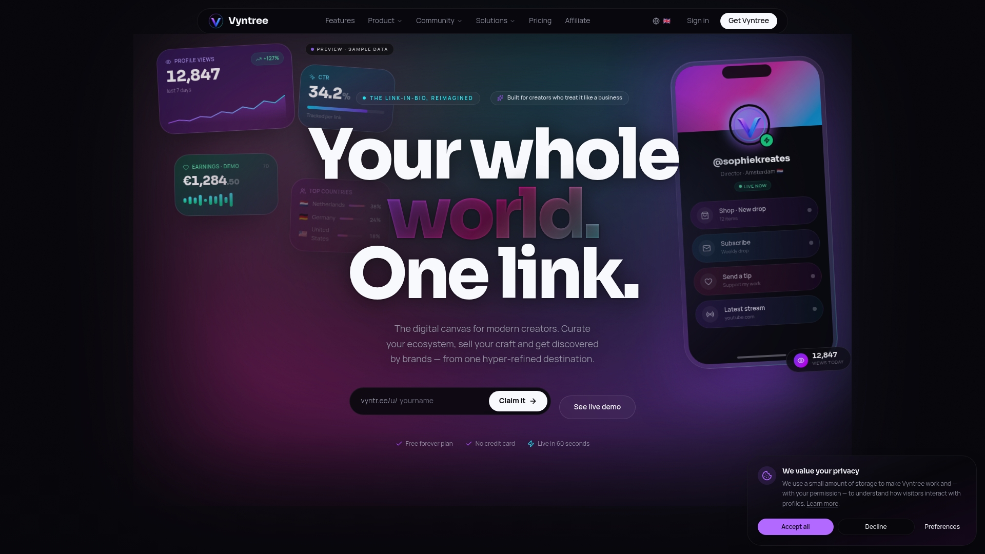
With Vyntr, small business owners and founders can consolidate their digital presence into one polished, high-converting page that showcases testimonials, links to key pages, and gives visitors everything they need to make a decision. No developer required. No duct-taped tools. Vyntr's business and founder tools are designed to help you present your brand credibly from day one, with the analytics to know what is actually working. If you are serious about turning visitors into customers, start there.
FAQ
What should a social proof display page include?
A strong social proof page includes star ratings, text testimonials, client logos, and at least one deeper proof format like a case study or video. Limit your proof stack to three to five types for the best conversion results.
How do I get more reviews for my small business?
Send a short follow-up email or SMS after every purchase or completed project asking for a review. Timing matters. Requests sent within 24 to 48 hours of a positive experience get significantly higher response rates.
Where should I link my social proof page from?
Link to it from your homepage navigation, your primary product or service pages, and any email sequences where trust is a barrier. The page works best when it is part of the buyer journey, not a standalone destination.
Does showing mixed star ratings hurt credibility?
No. Showing a realistic mix of ratings, including some three and four-star reviews, actually increases perceived authenticity. All-five-star profiles often trigger skepticism rather than confidence.
How often should I update my social proof page?
Use an auto-syncing review widget so the page updates continuously. Manually audit the featured testimonials every quarter to make sure your best and most recent proof is front and center.